I'm conducting a small experiment in selecting a sampler online. While I like all of the things I am stitching, I have a hankering to find a "historical" feeling sampler, and I want to find it online. I want a pleasing design not overwhelmed by alphabet/numbers--not for me the samplers with nothing but strip after strip of alphabet. There needs to be an architecturally pleasant house, some flora and fauna (preferably sheep, rabbits, cats and/or birds--all other wildlife is optional). I want my real estate to have a water view, something I could never afford IRL. A stream or pond is nice; an ocean is preferable. If an ocean, there should be a ship, either docked or sailing. The colors should be vibrant--not muted and dull--and contain little--if any--mauve, since I despise mauve. It has to be something I haven't seen all over the net and in every needlework shop. The Plymouth sampler (which I own), is a perfect illustration of many of the elements I'm looking for, but I've seen it everywhere, so it's disqualified for these purposes, although I'll stitch it very soon anyway! The design elements have to be balanced--neither crowded/cluttered nor sparse. It has to be complex enough to be interesting, but not so complex as to be daunting. It can be all cross stitch, or contain other stitches. Specialty fibers are great but not necessary.
The contenders, chosen after squinting at the tiny and in some cases blurred pictures online (and I have a 17-inch screen at work; it's just as bad there) have begun to arrive. Yesterday I received four. I won't post them all today, but I will post them periodically, along with my impressions. You're free to disagree, and bear in mind, even if I'm critical, I like ALL of these things and would not insult a designer; I'm simply expressing disagreement with some elements of the design. In short, I'm no expert or artist, but it's like any househunting expedition--some houses that others may find attractive might leave you cold. And you might fall in love with the funky house with the awkward rooms and bad mauve carpet because you love the built-in shelves around the stone fireplace.
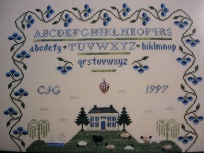
Open House Number One is "The Farm on Blueberry Hill" from Griffin Needleart Designs. I like this, but there is a problem. The colonial house is nice. The sheep are done in various colors of Wisper mohair fiber--fun. The colors are great, particularly the blue, and I love the twining blueberry vine. There's a cute pond with a bonus swan. The alphabet is simple and nicely balanced. What I don't like: there's too much empty space around the house--those flying birds don't fill it enough. And I don't mind charms and buttons, but they should enhance the design, not simply fill up some space. How I'd change the design: elmininate about 15-20 rows in the middle, pulling the house closer to the alphabet. Of course, the blueberry vine would have to be re-balanced as a result, but I believe that would be a winner. Not sure I want to go to the trouble, but I like the lovely colors and fuzzy sheep. In short, appealing, but not The One.
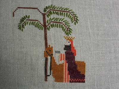
I'll leave you with a picture of my latest WIP: "The Birth of Jesus." I'm using 34 ct Legacy Linen in "wren's wing" and Needlepoint silks. Love this project so far, especially the lazy daisy stitches that form the fronds of the palm trees. I wish this were a larger, more complex project, because it's a blast to stitch.

7 comments:
Very nice stitches. I like the house and I love the project you are working on.
I agree with your observations about Farm on Blueberry Hill. I love samplers with houses in them. You're right on this one though, there is too much open space.
I can't wait to see what the other contenders are. Your Birth of Jesus piece is off to a great start - I love that palm tree! This one is going on my wish list. Whale Hunting is looking great too!
Phew, you've set yourself quite a task. I wonder what he other contenders will be...
Love the 'Birth of Jesus'!
Its going to be very interesting to see what samplers you have in the running for The One. I love the blue flower vine around the border of this one, but there is a lot of unfilled 'open' space in it. If only the house were just a wee bigger.
TBoJ is looking great!
I had to LOL about your sampler quest...what a challenge!
Maybe you should try getting you own show on HGTV...it be called "A Sampler with a View"...LOL! Your blog always makes my day!
:D
Your sampler is so pretty! I love it and can't wait to see more of it.
Post a Comment