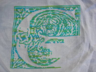
This is "Letter G" from M Designs' Alphabet Series. I'm stitching it on Lakeside Linens (can't remember the color exactly--I should write them down) using Silk 'N Colors Mermaid Shimmer. I like the design, love the fabric and adore the silk, so what could be the problem? A couple of things really. I believe the fabric is 32 count, and I've developed a fondness for the higher count fabrics--I'm doing HoHRH on 38, which feels just right to me. Or perhaps it should have been done over one. I saw someone else stitching another letter much smaller and I fell in love with that because it seemed both sharper and more delicate. Like lace. I could do it again, of course, but first and last names are both G's, so I'd have to do another G and I don't like to do a project twice.
Then there's the color of the variegated silk, which is G for gorgeous. However, I learned lately from my blog reading that the way to work with this best is to stitch each entire cross and then move on to the next cross and so on, rather than stitch a row of left-to-right legs and then move back across the row, completing all the crosses with right-to-left legs. I've experimented with this method on something else recently, and it does give a much better effect, especially with this thread, which has such a huge variation in colors.
I'll finish and frame it anyway; it's too close not to. It's not G for grotesque,after all. And two mats--in the green and the blue colors--might help unite the colors.
Perhaps next I'll do an "L"--for Live and Learn.
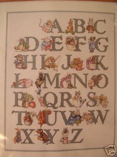
Oh! And I just found the Beatrix Potter picture online. Not quite what I would have guessed for placement of the letters:

1 comment:
Love the "G" piece from M Designs and the Beatrix Potter. Great that you found a pic of that, and your right the placement of the letters does seem a little odd.
Post a Comment